



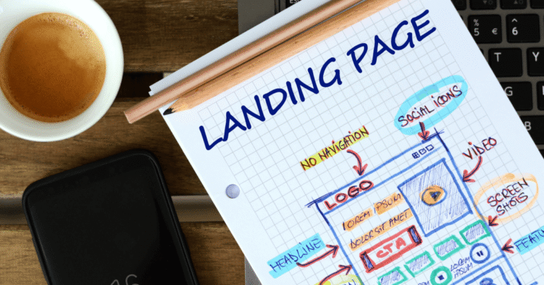
Small businesses often respond to a slow month by buying more clicks. That feels decisive, but it can be the most expensive way to avoid the real problem. If visitors arrive and cannot understand the offer, trust the company, or take the next step, additional traffic simply sends more people into the same leak.
The useful question is not “How do we get more visitors?” It is “What must a visitor believe before acting?” A landing page is the short conversation between an advert and a decision. It should explain who the offer is for, what changes after purchase, why the claim is credible, and what happens next.
In brief: The goal is not more platform activity. It is a clearer connection between audience intent, customer experience, trustworthy measurement and commercial value.
- The advert promises one outcome while the page leads with another.
- Mobile visitors must pinch, scroll or wait before they can act.
- Sales receives many enquiries, but few match the intended customer.
A simple way to spot a conversion problem
Start with behaviour, not design taste. A high bounce rate can indicate a weak message, but it can also reflect poor targeting or a slow page. Compare the advert, search term, page headline and call to action as one chain. When those four elements promise different things, visitors hesitate even if the page looks polished.
Read the page like a cautious customer
A cautious customer scans for relevance, proof and risk. Put the clearest outcome near the top, then support it with specific evidence: a named use case, a short result, a product screenshot, transparent pricing logic or a credible explanation of the process. “Best-in-class solutions” says little; “weekly bookkeeping for independent shops” removes uncertainty.
For a complementary perspective, a practical SaaS landing-page checklist shows how practitioners translate the same principle into campaign operations.
What to change before increasing spend
Before raising the budget, run a small sequence of controlled changes. Rewrite the headline around the visitor’s problem. Reduce competing calls to action. Move proof beside the claim it supports. Shorten the form to information the team will genuinely use. Test one meaningful hypothesis at a time so the result can guide the next decision.
| Signal | Likely issue | First check |
| High clicks, few enquiries | Message or usability gap | Headline, speed and form |
| Many poor-fit leads | Targeting or qualification gap | Search terms and offer |
| Good leads, weak sales | Handoff or follow-up gap | CRM response time |
A better weekly review
When internal teams lack research capacity or testing discipline, a conversion rate optimisation specialist can combine analytics, user behaviour, copy and experiment design. The useful outcome is not a prettier page; it is evidence about which message and experience help suitable visitors become qualified enquiries.
The quiet advantage of clarity
The strongest page is rarely the loudest. It is the page that helps the right person decide with less effort. That clarity lowers wasted ad spend, improves lead quality and gives a small company an advantage that larger competitors can easily overlook.
A practical seven-day landing-page check
Day one should establish the baseline: mobile load time, conversion rate, qualified-lead rate and the advert-to-page message match. On days two and three, speak with the people who answer enquiries. Their notes reveal whether visitors misunderstood price, eligibility, timing or the service area. Use days four and five to rewrite one important promise and move the strongest proof beside it. Keep traffic, audience and offer stable so the change has a fair test.
This is the core work behind conversion rate optimisation: finding where intent is lost, forming a testable explanation and measuring whether a change improves useful actions rather than superficial clicks. It includes research, analytics, copy, UX and experimentation. It is not simply redesigning a page or changing a button colour.
What a small business should expect from CRO
A credible CRO partner should explain the hypothesis, the primary metric, the quality guardrail and the minimum evidence needed before declaring a winner. The business should retain access to analytics and learn from unsuccessful tests as well as winners. Done well, CRO makes later traffic investment safer because each additional click enters a clearer, better-qualified journey.
Example: diagnose before redesigning
Imagine that a plumbing company receives plenty of mobile clicks but very few emergency bookings. The first check finds an eight-second load time and a headline about “complete property solutions” rather than urgent repairs. Compressing the page and matching the headline to the advert is a stronger first test than commissioning an expensive visual redesign.
Questions for the next review
- Record the hypothesis before editing the page.
- Measure qualified actions, not button clicks alone.
- Keep a winning variation long enough to confirm the effect.
The practical standard is simple: every metric should help someone make a better decision. When the evidence cannot change an action, simplify the report, improve the signal or ask a more useful question.
