



Modern applications depend on interactive data visualization to help users monitor performance, identify trends, and make informed decisions. From SaaS dashboards and financial platforms to healthcare portals and IoT systems, charts have become a core part of the user experience.
However, building a complete visualization system from scratch is complex. Responsive layouts, tooltips, zooming, accessibility, exporting, real-time updates, and browser compatibility all require significant development and maintenance.
A Charting API simplifies this process by handling rendering, interactions, responsiveness, and performance. This allows developers to focus on business logic while building scalable dashboards that integrate with frameworks such as React, Angular, Vue, and TypeScript.
This guide explains what a charting API is, how it differs from a charting library, and what to consider when choosing one for a production-ready data visualization application.
What Is a Charting API?
A Charting API is a software interface that enables developers to generate interactive charts and data visualizations by providing structured data and configuration options instead of manually drawing graphical elements.
Rather than writing hundreds or thousands of lines of rendering logic, developers typically define:
- the chart type
- the data source
- labels and axes
- colors and styling
- interactive behavior
- animation settings
The charting API then processes these settings and renders an interactive visualization within the application.
Most modern charting APIs use a JSON-based configuration model. Developers simply pass a configuration object containing the required options, allowing the API to handle rendering automatically.
For example, a developer may specify:
- Chart type: Column Chart
- Data source: Monthly sales
- X-axis: Months
- Y-axis: Revenue
- Theme: Light
- Tooltip formatting
Instead of manually calculating coordinates or drawing SVG elements, the charting API performs all rendering internally.
Charting API vs. Charting Library
Although the terms are often used interchangeably, a charting API and a charting library are not exactly the same.
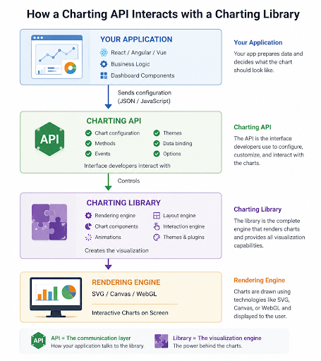
A charting library refers to the complete software package that provides visualization capabilities, including rendering engines, themes, plugins, and chart components.
A charting API is the interface developers use to interact with that library. It exposes methods, configuration options, events, and data structures that control how charts behave and appear.
Think of it this way:
- The library is the visualization engine.
- The API is how your application communicates with that engine.
For example, when developers configure chart properties through JavaScript objects or JSON, they’re interacting with the charting API rather than the rendering engine itself.
How a Charting API Fits into an Application
A charting API typically sits in the presentation layer of an application. Data is retrieved from one or more sources, processed by the application, and then passed to the charting API as a configuration object. The API communicates with the underlying charting library, which renders the final interactive visualization.
A simplified workflow looks like this:
Database
↓
REST API
↓
Application
↓
Charting API
↓
Charting Library
↓
Interactive Chart
This separation of responsibilities makes applications easier to maintain and scale. The backend focuses on collecting and preparing data, the application manages business logic and user interactions, the charting API provides the interface for configuring charts, and the charting library handles rendering the final visualization.
Rendering Technologies Behind Modern Charting APIs
Behind the scenes, charting APIs rely on different rendering technologies depending on the type of visualization and the performance requirements.
SVG (Scalable Vector Graphics)
SVG is widely used for business dashboards and interactive charts because it provides crisp graphics that scale across different screen sizes. It also supports accessibility features, CSS styling, and DOM-based interactions.
SVG works particularly well for dashboards containing dozens or even hundreds of interactive elements.
Canvas
Canvas renders graphics as pixels rather than individual DOM elements. This approach generally performs better when visualizing very large datasets containing thousands of points.
Canvas is commonly used for high-performance scientific or financial visualizations where rendering speed is the primary concern.
Read more about Canvas vs. SVG.
WebGL
Some advanced visualization platforms leverage WebGL to harness GPU acceleration for rendering extremely large datasets and complex visualizations. Although not necessary for every application, WebGL becomes valuable for specialized use cases involving millions of data points.
Modern charting solutions often abstract these implementation details, allowing developers to focus on configuring charts rather than managing low-level rendering technologies.
Why Use a Charting API Instead of Building Charts from Scratch?
For simple demonstrations or small personal projects, creating a basic chart from scratch may seem manageable. However, production applications have much higher expectations. Users expect responsive dashboards, smooth animations, interactive filtering, accessibility support, export capabilities, and compatibility across browsers and devices.
Recreating these capabilities internally requires significant engineering time and ongoing maintenance.
A charting API eliminates much of this complexity by providing production-ready visualization components that have already been tested across numerous scenarios.
Faster Development
Developers can build interactive dashboards in days instead of weeks.
Instead of implementing rendering algorithms, animation logic, event handling, and responsive layouts, teams can focus on solving business problems and delivering features that differentiate their applications.
Easier Maintenance
Visualization requirements often change as products evolve. New chart types, additional interactions, updated themes, and accessibility improvements become easier to implement when they’re supported by the underlying charting solution rather than custom code.
Many charting APIs also receive regular updates that improve performance, security, and browser compatibility.
Consistent User Experience
Applications frequently contain multiple dashboards and reporting pages.
Using a centralized charting API helps ensure consistent styling, animations, color schemes, typography, and user interactions across the entire application.
This consistency contributes to a more professional user experience while reducing duplicated development effort.
Built-In Interactive Features
Modern users expect charts to do more than display static information.
Most charting APIs provide built-in capabilities such as:
- Tooltips
- Zooming
- Panning
- Drill-down
- Cross-highlighting
- Legends
- Selection
- Hover effects
Implementing these interactions manually would require considerable engineering effort and ongoing testing.
Accessibility Support
Building accessible visualizations requires careful consideration of keyboard navigation, screen reader compatibility, semantic markup, and sufficient color contrast.
Many enterprise charting solutions already include accessibility features that help developers build more inclusive applications while aligning with accessibility standards.
Responsive Design
Applications today are viewed on desktops, tablets, and smartphones.
A good charting API automatically adapts layouts, labels, legends, and interactions to different screen sizes without requiring developers to create separate implementations for each device.
Export and Sharing Features
Business users often need to download reports or share visualizations with colleagues.
Rather than building custom export functionality, many charting APIs include built-in support for exporting charts as:
- PNG
- SVG
- CSV
These capabilities can significantly reduce development effort while improving usability.
Better Reliability
Visualization libraries used in production environments have typically undergone extensive testing across browsers, operating systems, and edge cases.
Leveraging these well-tested components generally results in fewer rendering issues than maintaining a custom visualization engine.
Build vs. Buy: A Comparison
The following comparison highlights the key differences between building charting functionality from scratch and using a dedicated charting API. While custom implementations may suit simple projects, charting APIs typically provide faster development, lower maintenance, and a richer set of production-ready features.
| Build Yourself | Use a Charting API |
| Longer development time | Faster implementation using ready-made components |
| Manual implementation of tooltips, zooming, and interactions | Built-in interactive features such as zooming, tooltips, drill-down, and panning |
| Higher maintenance as requirements evolve | Regular updates and improvements from the solution provider |
| Greater risk of rendering bugs and browser compatibility issues | Mature, well-tested components designed for production environments |
| Limited chart types unless additional development is invested | Wide variety of chart types available out of the box |
| Separate effort required for exporting, accessibility, and responsiveness | Exporting, accessibility, and responsive behavior are often included |
| Developers spend time maintaining visualization infrastructure | Developers can focus on business logic and delivering user value |
As applications grow in complexity, the advantages of using a charting API become increasingly clear. Rather than investing engineering resources in visualization infrastructure, development teams can prioritize the features that make their applications unique while relying on proven charting technology to deliver interactive, scalable, and maintainable data visualizations.
Features to Look for in a Modern Charting API
Not all charting APIs offer the same capabilities. While a simple library may be sufficient for basic visualizations, production applications often require a broader feature set to support scalability, usability, and long-term maintenance. When evaluating a charting API, consider the following capabilities.
Wide Variety of Chart Types
As applications evolve, reporting requirements often become more sophisticated. A charting API should support a comprehensive range of visualizations so developers can meet current and future business needs without introducing additional libraries.
Look for support for chart types such as:
- Bar and Column Charts
- Line Charts
- Area Charts
- Pie and Doughnut Charts
- Scatter and Bubble Charts
- Heatmaps
- Treemaps
- Gantt Charts
- Geographic Maps
- Combination Charts
Having multiple chart types available through a single API helps maintain a consistent user experience while simplifying development and maintenance.
Performance with Large Datasets
Performance becomes increasingly important as applications grow. Dashboards displaying thousands of data points or updating frequently should remain responsive and smooth.
Features that improve performance include:
- Efficient rendering engines
- Lazy rendering
- Incremental updates
- Virtualization techniques
- Intelligent data aggregation
These capabilities reduce unnecessary rendering work and improve responsiveness, especially in data-intensive applications.
Rich Interactive Features
Interactive charts help users explore data rather than simply viewing it. A modern charting API should provide built-in interactions that improve usability without requiring custom development.
Common interactive features include:
- Tooltips
- Drill-down and drill-through navigation
- Zooming
- Panning
- Data selection
- Cross-filtering
- Interactive legends
These features allow users to investigate trends and uncover insights more effectively.
Real-Time Data Support
Many modern applications require continuously updating visualizations. Monitoring systems, financial platforms, manufacturing dashboards, and IoT applications often display live data streams rather than static reports.
A capable charting API should efficiently support:
- Streaming data
- Live updates
- WebSocket integration
- Automatic refreshes
- Smooth animated transitions
These capabilities help ensure dashboards remain responsive even when underlying data changes frequently.
Framework Compatibility
Most development teams work within established frontend ecosystems. Choosing a charting API that integrates well with popular frameworks reduces implementation time and simplifies maintenance.
Look for official or well-supported integrations with:
- React
- Angular
- Vue
- JavaScript
- TypeScript
Framework compatibility also helps teams reuse components across multiple projects while following existing development practices.
Accessibility
Accessible visualizations make applications usable for a broader audience and support compliance with accessibility standards.
Important accessibility features include:
- Keyboard navigation
- Screen reader compatibility
- High color contrast
- Semantic markup
- Descriptive labels and alternative text
Accessibility should be considered early in the development process rather than added later.
Exporting and Sharing
Many business applications require users to export reports or share visualizations with colleagues.
Modern charting APIs often include built-in exporting capabilities for formats such as:
- PNG
- SVG
- CSV
Native export support eliminates the need to build custom reporting functionality and provides a more consistent user experience.
Designing Scalable Data Visualization Apps
Choosing a powerful charting API is only part of the solution. Building scalable applications also requires thoughtful architecture and development practices. A well-designed visualization layer should remain maintainable as datasets grow, new reports are added, and user demands increase.
Separate the Data Layer from the Presentation Layer
Charts should focus solely on displaying information rather than retrieving or processing it directly.
A common workflow is:
API → Data Transformation → Chart
Separating these responsibilities improves maintainability and allows multiple visualizations to reuse the same processed data.
Load Data on Demand
Loading every dataset during the initial page load can negatively impact performance.
Instead, load information only when required by using techniques such as:
- Lazy loading
- Pagination
- Server-side filtering
- Incremental loading
This approach reduces bandwidth consumption and improves application responsiveness.
Reuse Chart Configurations
Enterprise applications often contain dozens of dashboards with similar styling.
Instead of duplicating configuration code, create reusable components that share:
- Themes
- Color palettes
- Typography
- Axis formatting
- Tooltip styles
- Layout templates
This promotes consistency while making future design updates easier.
Optimize Rendering
Rendering performance has a direct impact on user experience.
Developers should:
- Choose the most appropriate rendering technology
- Avoid unnecessary chart re-renders
- Update only modified datasets
- Minimize expensive DOM operations
Efficient rendering becomes increasingly important when displaying multiple charts simultaneously.
Reduce Network Requests
Network performance is just as important as rendering performance.
Applications can reduce unnecessary API calls by implementing:
- Response caching
- Data aggregation
- Compression
- Request batching
These techniques improve dashboard responsiveness while reducing backend load.
Design for Multiple Devices
Modern dashboards are expected to work across desktops, tablets, and smartphones.
Responsive visualization involves more than simply resizing charts. Developers should also consider:
- Adaptive layouts
- Flexible legends
- Readable labels
- Touch-friendly interactions
- Mobile navigation patterns
Designing with responsive behavior in mind helps ensure a consistent experience across devices.
Common Use Cases for Charting APIs
Charting APIs are used across many industries wherever data needs to be presented visually and interactively.
Business Intelligence Dashboards
Organizations use dashboards to monitor key performance indicators (KPIs), compare historical trends, and support executive decision-making through interactive reports.
SaaS Analytics Platforms
Software-as-a-Service applications frequently include customer analytics, subscription metrics, feature adoption reports, and operational dashboards to help users understand product usage.
Financial Reporting
Banks, investment firms, and accounting platforms rely on charts to visualize revenue, expenses, market performance, portfolio allocation, and forecasting data.
Sales and CRM Dashboards
Sales teams use interactive dashboards to monitor pipelines, conversion rates, regional performance, and customer engagement metrics in real time.
Healthcare Monitoring
Healthcare applications visualize patient statistics, treatment outcomes, medical device readings, and operational performance through secure dashboards.
Manufacturing and Operations
Manufacturers monitor production output, equipment utilization, quality metrics, inventory levels, and maintenance schedules using real-time visualizations.
IoT Monitoring
Internet of Things (IoT) platforms continuously collect sensor data from connected devices. Interactive charts help operators monitor equipment status, detect anomalies, and respond quickly to changing conditions.
Project Management
Project management applications use Gantt charts, timelines, resource allocation charts, and progress dashboards to help teams plan and track project execution.
Marketing Analytics
Marketing platforms visualize campaign performance, website traffic, customer acquisition, advertising spend, and conversion metrics, enabling marketers to optimize strategy based on real-time insights.
Across these scenarios, a modern charting API enables developers to build interactive, responsive, and scalable data visualization experiences without having to implement visualization infrastructure from scratch.
Conclusion
As applications become more data-driven, choosing the right visualization approach is essential for delivering a fast, engaging, and maintainable user experience. A Charting API simplifies the development of interactive charts by providing ready-made capabilities for rendering, responsiveness, accessibility, exporting, and real-time updates, allowing development teams to spend less time building visualization infrastructure and more time creating valuable features.
Beyond reducing initial development effort, a modern charting API helps applications scale as requirements evolve. Support for a wide range of chart types, framework integrations, reusable configurations, and performance optimizations makes it easier to expand dashboards without extensive rewrites or ongoing maintenance.
When evaluating a charting API, consider not only your current requirements but also the future needs of your application. Choosing a feature-rich, well-supported solution early can reduce technical debt and provide a solid foundation for long-term growth. Ultimately, the right charting API enables developers to focus on what matters most—turning data into clear, interactive insights that help users make better decisions.
Frequently Asked Questions
What is a charting API?
A charting API is an interface that enables developers to create interactive charts and data visualizations by supplying data and configuration options, rather than building chart-rendering logic from scratch.
What is the difference between a charting API and a charting library?
A charting library is the complete software package that renders charts and provides visualization features, while a charting API is the interface developers use to configure, customize, and interact with that library.
Which charting API is best for JavaScript applications?
The best charting API depends on your project’s requirements, including chart types, performance, framework compatibility, documentation, accessibility, and licensing. For enterprise applications, choose a solution that supports scalability and long-term maintenance.
How do charting APIs handle real-time data?
Many charting APIs support real-time updates by integrating with technologies such as WebSockets, Server-Sent Events (SSE), or periodic polling, allowing charts to update dynamically as new data becomes available.
Can charting APIs work with React, Angular, and Vue?
Yes. Most modern charting APIs provide integrations or wrappers for popular frameworks such as React, Angular, and Vue, making it easier to build interactive charts within existing applications.
What features should I look for in a charting API?
Look for support for multiple chart types, interactive features, responsive design, accessibility, real-time updates, exporting, strong documentation, framework compatibility, and good performance with large datasets.
How do charting APIs improve application scalability?
Charting APIs improve scalability by providing reusable visualization components, optimized rendering, consistent user experiences, and built-in features that reduce custom development and simplify maintenance as applications grow.
